Samsung Times Square
With the rich legacy of Samsung’s brand and the epic scale of Times Square as our venue, it was deeply inspiring to create works of art with Samsung’s product at the core of each concept. We partnered with Superfad in LA to explore several style treatments that would beautifully merge our Samsung product line with the worlds of art, science, and nature to create engaging journeys and colorful abstract narratives.
As for the physical Times Square billboard itself, we sold in the redesign concept that would mirror the design of their new Galaxy Edge Phone.
Fun fact about the work: My infant son was actually featured on one of the animations under the headline “adorable”.
2012 Samsung Times Square multi product motion graphics animations
2012 Samsung Times Square motion graphics animations featuring “A Pixels Journey” highlighting the many complex layers of their flat screen LED technology.
Samsung Times Square 2011 Pixel Cubes
In 2011 we created the first ever Pixel Cube motion graphics animation the transition from scene to scene using large pixel cube animation. The purpose was to grab passerby’s attention and draw them into each scene of diverse consumers using our products in various ways.
Fun fact about the pixel cubes work: It was featured in many films including a prominent highlight in Men In Black with Will Smith and Tommy Lee Jones.
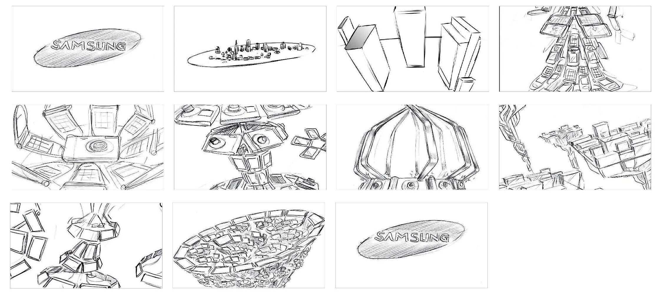
Motion Graphics Exploration
The design directions below highlight a deep exploration which was the first step in developing what will ultimately become a pair of wondrous and compelling videos for this space.
Direction 1 - Sideways Kaleidoscope
This concept refers both subtly and directly to Times Square and its significance as a capital of entertainment. The Samsung logo becomes an oval symbolic of the island of Manhattan as a series of 3D buildings extrude and fold out from it. We travel into this “Times Square” of Samsung. And this is where our real journey begins, traveling through a world of kaleidoscopic products that transform and shift in harmony with a continually moving camera. The light-filled shapes are all on a glossy black surface, with a neon-like colorful glow that has a playful, poppy attitude. Products here are all treated with a high sheen, not entirely photoreal but suggestive to fit within the world. This all creates a celebratory atmosphere that culminates in a ring of TVs that forms the Samsung logo, surrounded by colorful light flashes reminiscent of fireworks.

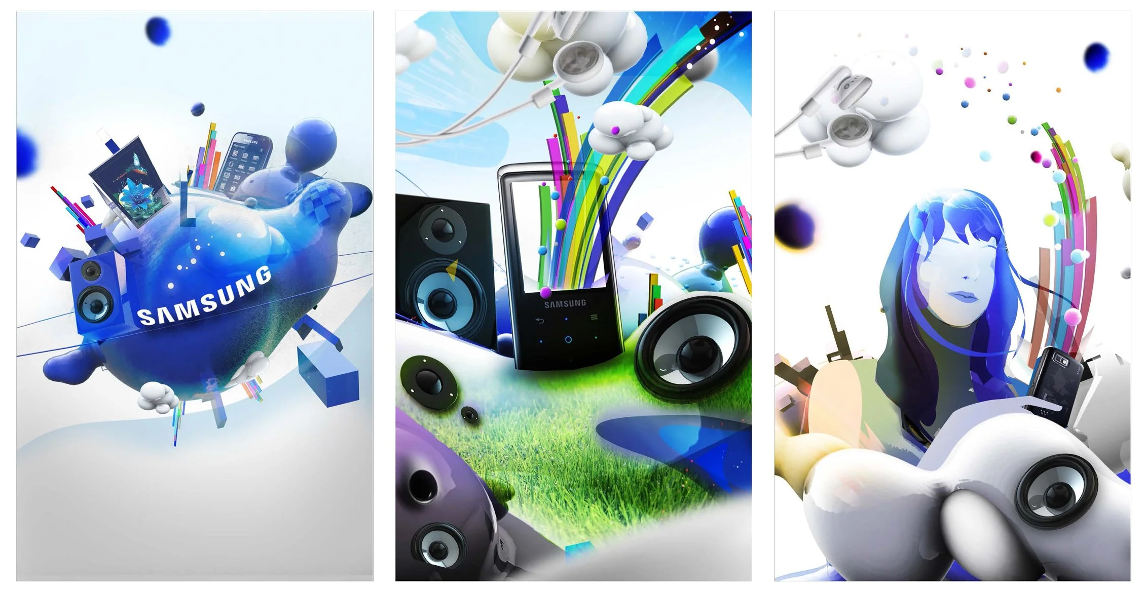
Direction 2 - Liquid Blue
This is a highly environmental approach, combining both the light and dark worlds of Samsung branding and products. A reflective Samsung logo expands outward with a liquid texture, almost like an amoebic organism that is replicating into new cells. These liquid transitions form the heart of the piece, carrying us smoothly from one moment to the next, showcasing Samsung products along the way. Throughout, stylized human forms will inhabit the landscape, and their simple actions will often serve as our transitions for camera movement and dimension. There is an organic flow to the movement here that suggests the usability and human interaction that we have with Samsung products.
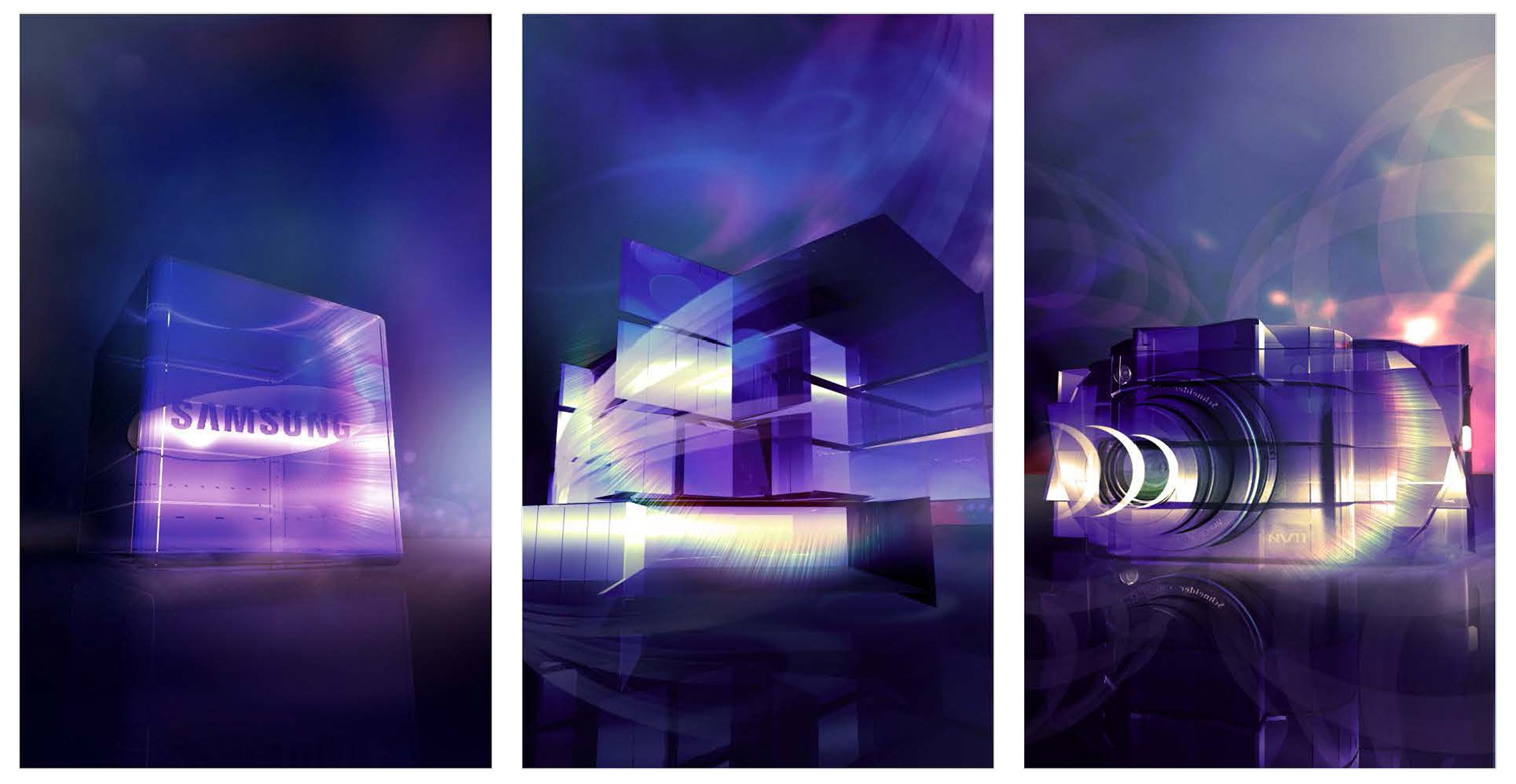
Direction 3 - Glassy
A glass cube here becomes the center of the Samsung universe. We open on this glowing cube sitting on a black surface, all set against a beautiful reflective background. The cube then unfolds and transforms to reveal a camera, a TV screen, a Blu-ray player, and more. Throughout, the shapes shift in organic and geometric ways to form each new product. With each permutation, we suggest these products with a high-gloss glow and transparency. Despite its rigid appearance, the glass structure might fold along symmetrical lines like a piece of origami paper.
Throughout, our camera remains focused around this ever-changing center plane, showcasing the glowing facets of the cube and the various products from multiple angles. Ultimately, the cube structure transforms into a spherical surface that contracts and shifts to become the Samsung logo.
Direction 4 - Organic Dissections
In this direction, the Samsung logo becomes a fluid organism that separates and builds from one product into the next. We set this piece within a light-filled space, backlighting the logo as we begin. As the ring of the logo separates outwards, it opens into the lens of a camera. This camera in turn then stretches apart. The various products separate in space and give us an exploded view of their inner workings, with a high-gloss texture and a dreamlike deconstruction. We follow the “breathing” movement of these shapes as they suck in and out, transforming from one product to the next. Along the way, various graphic elements evolve outward from the products, connoting their usages and a metaphorical suggestion of the Samsung experience. Ultimately, all of these elements are sucked back inward into the Samsung logo.

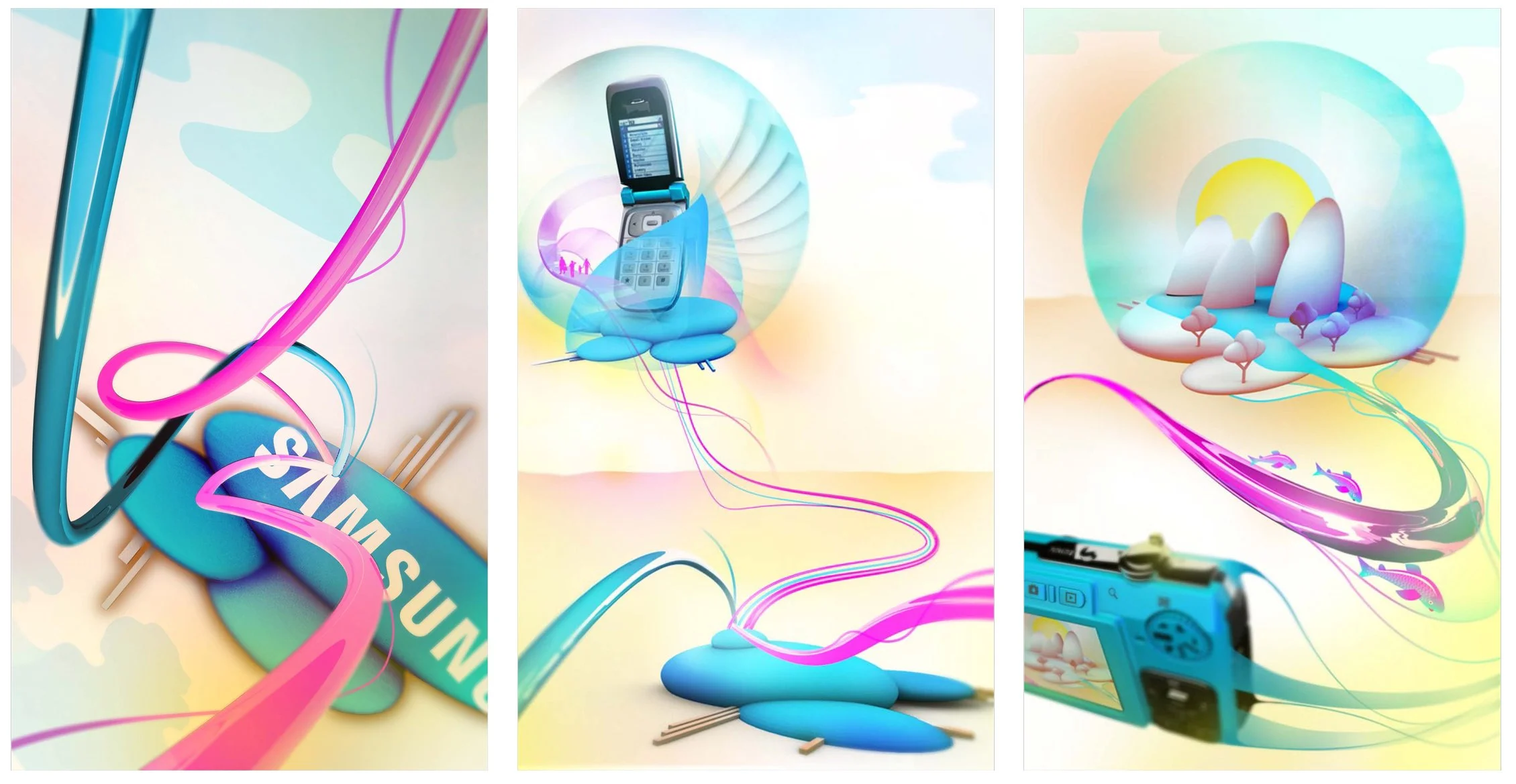
Direction 5 - Connected Blossoms
Imagine that there are unique worlds contained inside of the Samsung logo ellipses. These might begin as 2D logos, but as they rotate, they take on depth and dimension, becoming mini-planets that contain beautiful graphic environments, each belonging to a different Samsung product. Colorful root-like structures that suggest both technological and human connection form the connective tissue between the worlds and guide our movement through the piece. Throughout, we follow a pulsing glow of light across the interconnected structures, providing a life-force that travels from one world to the next. It is the interconnection provided by the blooming, blossoming movement of the roots and tendrils that merges technology and humanity to speak to Samsung’s brand philosophy.
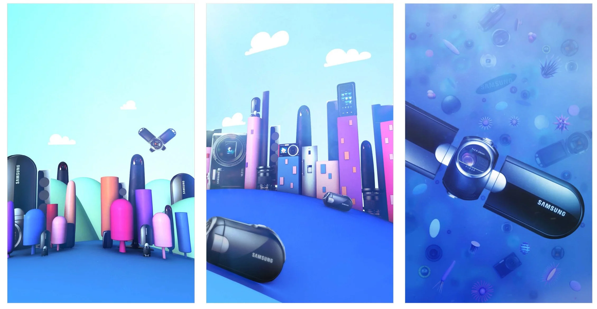
Direction 6 - Fantastic Voyage
This direction takes us on a journey through a world of Samsung-inspired landscapes. With a continual sense of travel, the camera flies through a series of different terrains and locations composed of formally-related shapes that represent Samsung products in an environmental way. These products are not photoreal, but rather more whimsical and suggestive in their shapes and textures. We suggest a passage of time as we move from light to dark and back again, covering a vast landscape of organic technology. A fluid sense of motion creates a satisfying and engaging journey.